How to Write an Email that Works
If you are reading this, you are having one of two issues.
- People don’t bother to open your emails.
or
- People aren’t reading or taking action on those emails.
The good news is that you are not alone.
Fortune 500 companies have email marketing teams of developers, copywriters, and automation specialists to craft emails that are engaging, punchy, and most importantly, emails that work. While it may take years of practice to refine your skills to that of a seasoned copywriter, there are best practices that you can apply to see immediate results.
Rule #1: If they don’t read it now, they won’t read it later.
For readers to take action on an email, they first have to open it.
Think about it personally. Every morning you check your email and make two lists: Open Now, and Open Later.
And if we’re being honest, later never comes. If readers don’t see your subject line and mentally file you in the Open Now column, your email is doomed. How can you change this? Write better subject lines.
Writing Subject Lines People Actually Open
Let’s use a real-life example.
Email Subject: Illinois Should Use its Rainy Day Fund to Minimize Tax Increases
Instead, let’s try: Illinois’ alternative to another tax
Why is this more effective? Because people like stories (and HATE taxes).
The second subject line is half the length, making it completely viewable in your reader’s inbox. This increases the open rate and engagement dramatically. For example, 7-word subject lines are the most common word length; 14.0% of all emails. 15.8% of those emails are opened. 3-word subject lines (1.6% of them) have the highest engagement rates, 21.2%.
Additionally, the phrasing leaves the question “Well, what’s the alternative?”. And if you can force a question into your reader’s head, they will open your email.
Think of movie trailers. Trailers tease you into watching the full movie. The same thing is true with emails. Readers want to know the full picture. They want completion and that drives open rates. Your subject line should only tell the first half of the story. In this case, the original email subject told essentially the full story directly in the subject line. Because of that, there’s a limited motivation to open the email. Could you imagine if the Avengers Endgame trailer said: “Ironman dies at the end”?
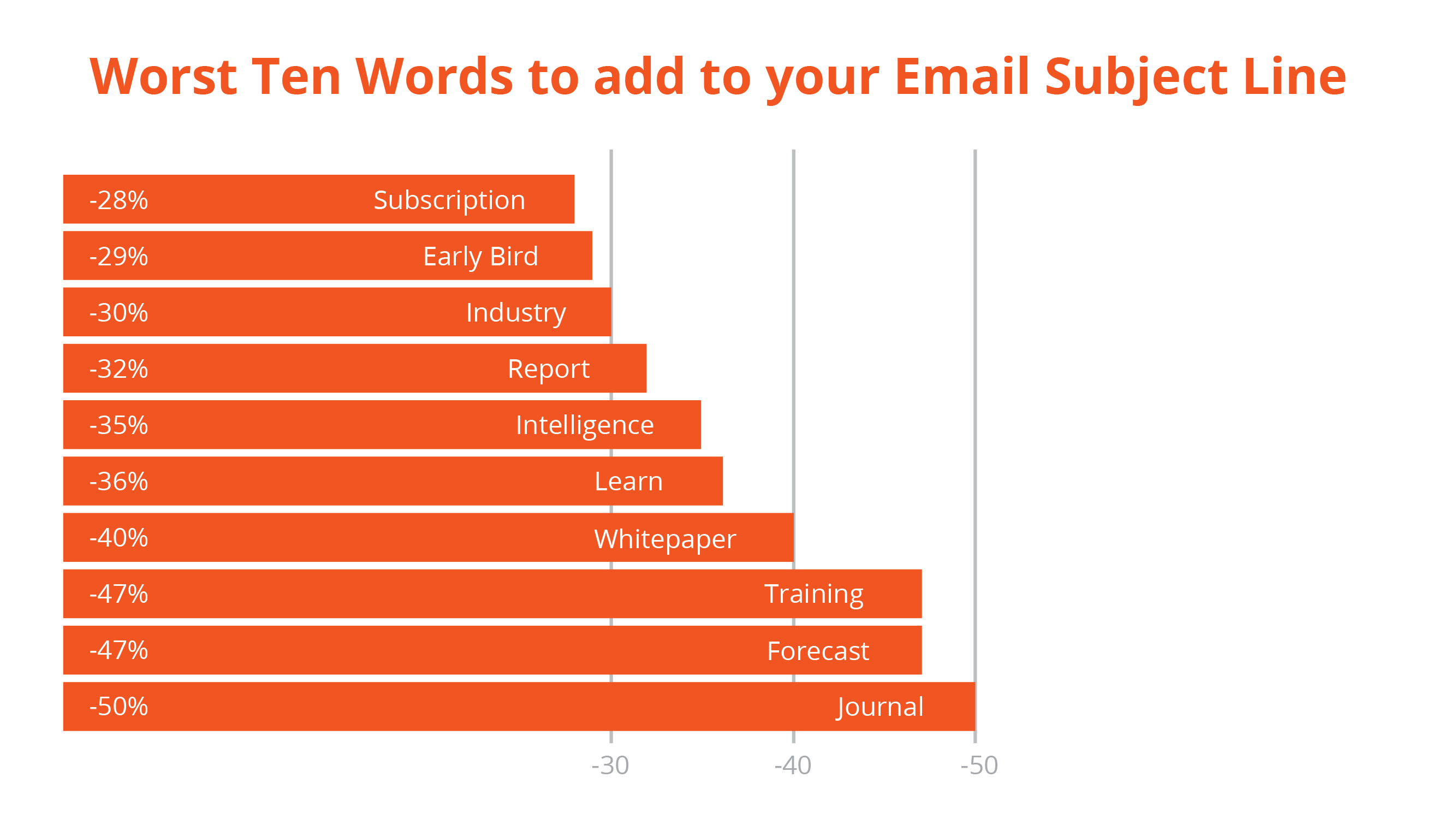
This graph further illustrates my point. Email subject lines should promote the value of your resource rather than the medium your resource comes in.

But then what?
Establishing Cadence
If they don’t read your first line, they won’t read your second.
Forget what they told you in school. Write short, choppy copy.
It does three things.
- It gets your readers to the important information in your email, faster and easier.
- Makes for better writing because you cut out the BS.
- It improves your click-through rate.
How does choppy writing improve your click-through rate?
A good writing cadence commands your attention. Cadence propels your readers quickly through your message and on to the main point of your email: taking an action.
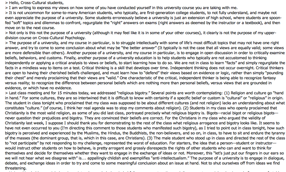
There is one thing that will slow down your readers more than anything, a wall of text.
(Example of a wall of text)

This gives me anxiety. Don’t you hate it when you get an email that’s so condensed it’s hard to read? Well literally everyone else does too. The reason being that it’s hard to decipher what’s important, what needs action, or what’s an angry rant from a deranged individual.
Use headings. Break up paragraphs. White space helps your eyes navigate between sections and that makes readers more likely to continue reading.
Emails should be easily digestible. If your email is so long that it needs an index, you may want to consider repurposing that content as a whitepaper or blog post. You can always use your email to direct users to your content.
Crafting a call to action
What’s the actual point of your email?
Do you need support? Are you selling something? Do you want to drive traffic back to content on your website?
Make that clear.
A good CTA should fill in this blank, “I want to ____,”, whether that’s to “start a demo”, “read the report”, or “get a guide”. The more specific the better.
A good email call to action considers two questions.
- What is my motivation for clicking this button?
- What am I going to get when I click this button?
Practically speaking, separate your CTA from the email body. In HTML formatted emails, create a button that’s clearly visible that directs users to your goal. In plain text, separate the CTA to its own paragraph.
It all works together
Repetition and consistency are key. Positioning your brand and email marketing as a valuable resource and source of insight sets you up for long term success.

Mission
Fuel
Digital Design Trends to Empower your Mission
Other Articles You Might Be Interested In:
Good Design Is A Result of Good Accessibility
BLOG As we continue our coverage of accessibility and ADA compliance, I wanted to explore how design is impacted and even enhanced by strong accessibility standards. For a little backstory, accessibility is an initiative to open the doors to people with visual or...
Strong accessibility means better SEO
BLOG Site accessibility (also known as ADA compliance) improves SEO by addressing readability. If users can easily read your site so can search crawlers like Google, Bing and the like. We have discussed the importance of ADA compliance for your site. But it is...


